

 By
By 
Since Skatter Tech 3.0 made its debut just a few days before at the end of 2010, many have written in asking questions about how the design came together. I spent nearly three months designing and developing the platform before it went live. It has been about a full month of smooth sailing since launch, so I thought it was about time I shared the full story. Here is the full scoop including my notes from the decision process, early sketches, and various mockups:
Say Goodbye To The Traditional Blog Format

Although Skatter Tech initially started off on Blogger and spend a short time on Movable Type, I soon settled on WordPress. The original layout featured partial articles stacked above one another with “Read More” links to view the full story. While there is nothing wrong with that template, it makes it difficult for readers to quickly view more than a story or two at a time. In addition, the sidebar was an awfully large waste of space. Although a list of popular posts at the top of the column often helps attract a few clicks, additional links were rarely helpful for navigating through the website. Plus, the traditional blog format feels too 2005. It was definitely time for a refresh.
Deciding On The Best Structure

Most publications organize posts with two factors: categories and tags. While these help filter a vast amount of content down to sets of posts, I soon realized that these often overlap leading to a confusing experience for readers. Rather than creating hundreds of categories, I decided to keep things simple. I narrowed all articles down to six hubs: News, Reviews, Opinion, Hacks, Media, and Deals. As for tags, I choose to use the feature to label company names and events. Sorting through tons of old articles took a long time, but it helped clean up the chaotic and unusable structure.
Planning For Multiple Custom Layouts

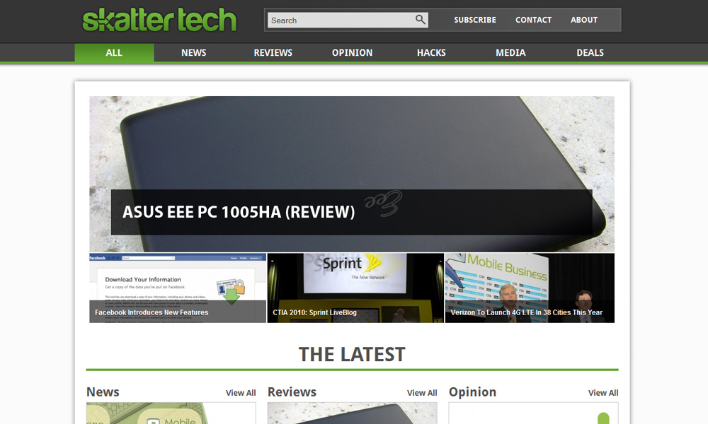
Once I had tided up older stories and settled on a new structure, I decided to create custom layouts for each hub. It was important to represent different types of stories appropriately in each section. News is fast paced, so I went with a Twitter-inspired streamlined design. For Reviews, I choose to prominently feature an image of a product, making articles easy to identify. Since Opinions are generally lengthy, a short excerpt appears along with the preview of each post. I kept the same thought process going when it came to picking layouts for the Hacks, Media, and Deals hubs as well.
I also realized the importance of letting visitors get to each of these hubs easily. I soon came up with an idea to have a “floating menu bar” that hovers at the top of the page at all times. In addition to making switching between hubs fast, it also helps visitors learn where things are.
Heading To Photoshop For Mockups

After spending a few days attempting to upgrade the existing Skatter Tech template, as seen above, I began to despise the old fashion look. It was time for an even larger revamp. Over the next few days, I experimented with various color schemes and styles for the redesign. The following are just a few of the decent-looking options I managed to create:

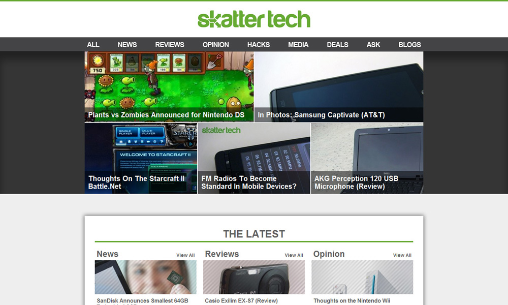


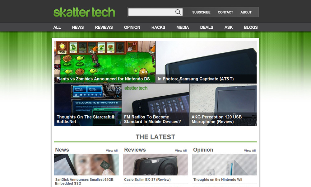
If the mockups did not give it away, the home page portal was an important part of the design process. I wanted an extremely easy way for readers to quickly preview the latest stories from each hub. With some inspiration from CNN.com and other magazine style layouts, I created a unique layout which makes plenty of content available at a glance.
Selecting clean layouts with proper spacing, appropriate colors, and friendly fonts is critical. Although there are various layouts, I wanted a consistent recognizable style across the entire site. Avoiding too much clutter is important otherwise people will leave if they can not figure out what to look at. I found that removing elements was occasionally necessary, even if it was fancy.
Selecting Features And Development
During the design process, I started building a thorough to-do list which soon reached a few hundred items in length. I spent some time prioritizing important features and dumping far-fetched ideas. Some items that made the final cut include threaded comments, support for mobile devices, easy subscription tools, accurate search results, and recent activity widgets.
Getting the code working optimally took over a month. Since WordPress has limitations when it comes to certain tasks, I had to develop a custom engine to fill the gaps. I even designed some basic APIs for my “mini platform” to keep things flexible enough for easy upgrades and future expansions. I also tried to avoid making any major changes to the original WordPress code to ensure that I could upgrade to new releases without too much hassle.
For optimal performance, I cache and compress all pages. I choose Rackspace for hosting along with Amazon CloudFront for speeding up access times. To make Skatter Tech search engine friendly, I read through many tutorials and tips. I even used automated tools to track down broken links.
Compatibility For Everyone

Another task that stole a chunk of time was guaranteeing compatibility for all major web browser including Chrome, Firefox, Internet Explorer, Opera, and Safari. In addition, I wanted the site to run properly for visitors without JavaScript enabled. Since small-screen netbooks are fairly popular, I even spent an entire day testing Skatter Tech on just about every possible display resolution.
When it came to mobile devices, I prioritized offering an optimized version for feature phones which would have no way of rendering the full site. For those wondering, a touch enabled iteration of Skatter Tech for smart phones and tablets is in the works.
Adding Some Polish

Before launching, I created private password protected invites for letting a handful of people test the site. These users provided plenty of early feedback which was immensely valuable. It also brought up a handful of bug reports, allowing me to fix issues before Skatter Tech 3.0 went live.
I also spent time creating quality documentation across Skatter Tech to offer details about who we are, what we do, and how things work. I even designed an extremely simple contact form, which people are actually willing to use. Every little detail matters.
Helpful Resources
For those wondering, I am not a professional web designer or developer. This was my first major feat. Although I also built the older version of Skatter Tech, that was over five years ago and based on a robust sandbox theme. I did not buy any books or take any traditional classes, instead I used the internet. There are more tutorials and resources than one can possibly imagine. For those taking a first step into web development, definitely checkout Google University.
For WordPress, the official Codex and Support Forums was a great starting point. I even bugged a few official developers, who were kind enough to help. For jQuery and JavaScript, the community at StackOverflow was incredibly helpful. I brushed up on the latest HTML5 standards with the Dive Into HTML5 online book. W3Schools has plenty of details on CSS3. QuirksMode offers browser compatibility information. Viewing the source of popular websites to learn how things work is also a great idea. The Firefox Firebug extension or the built-in inspectors for Chrome, Opera, and Safari makes that easy.
Links: Skatter Tech


Looks awesome dude, nice work, it’s a great inspiration.
Hey Sahas, even I’m planning to put up a professional looking and easy-to-use tech blog. Wanted to build an exclusive and modern wordpress theme from scratch but didn’t know where to start. Thanks for sharing your experience and the resource links, this should be of great help. Thanks again!
This post is awesome. Many want to know behind the scenes of awesome stuff.